The spider chart is often the most overlooked weapon in performance management—while most managers drown in endless spreadsheets and subjective feedback. Traditional performance reviews feel like guesswork: vague comments, inconsistent scoring, and zero clarity on what truly drives employee potential.
Imagine spending hours in reviews, only to realize you’ve learned nothing actionable about your team’s real strengths and weaknesses. Every performance conversation becomes a frustrating dance of uncertainty, where critical skills go unnoticed and genuine talent remains hidden.
Enter the performance appraisal spider chart: a visual game-changer that transforms how we understand, assess, and develop talent. By mapping multiple performance dimensions simultaneously, this powerful tool gives leaders an instant, comprehensive view of individual and team capabilities—turning complex data into crystal-clear insights.
In this blog post, we’ll tell you everything you need to know about spider charts for performance management. Let’s go!

🕸️ What is a Performance Appraisal Spider Chart?
A performance appraisal spider chart is a graphical tool used to visualize employee performance across multiple dimensions. It is used by organizations to quickly identify how an individual’s performance measures up against expected standards.
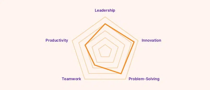
The spider chart features multiple axes radiating from a central point. Each axis represents a distinct performance dimension. It reveals the unique pattern of each employee’s strengths and growth areas, like:
- Leadership: Can they guide the ship?
- Innovation: Do they spark new ideas?
- Problem-Solving: How well do they tackle challenges?
- Teamwork: Are they a team player?
- Productivity: Can they get things done?
Think of it like a spider web diagram.
You rate different skills from 1 to 10 or low to high, mark those ratings on each line (like spokes of a wheel), and connect the dots. The shape you create shows what you’re good at (where the shape bulges out) and what needs work (where it dips in).

This makes it easy to spot strengths and weaknesses at a glance, which helps guide better conversations during reviews.
🕸️ Example of a Performance Appraisal Spider Chart
To understand how a performance appraisal spider chart works, let’s consider an example.
Let’s look at how two employees shine in different ways. We’ll rate them from 1-10 in five key areas:
- Leadership
- Innovation
- Problem-Solving
- Teamwork
- Productivity
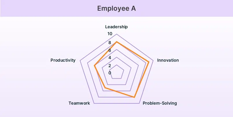
Meet Alex (Employee A)
Think of Alex as your creative strategist. They’re great at leading (8/10), coming up with new ideas (9/10), and solving tricky problems (8/10). But when it comes to teamwork (5/10) and getting things done quickly (6/10), there’s room for growth.

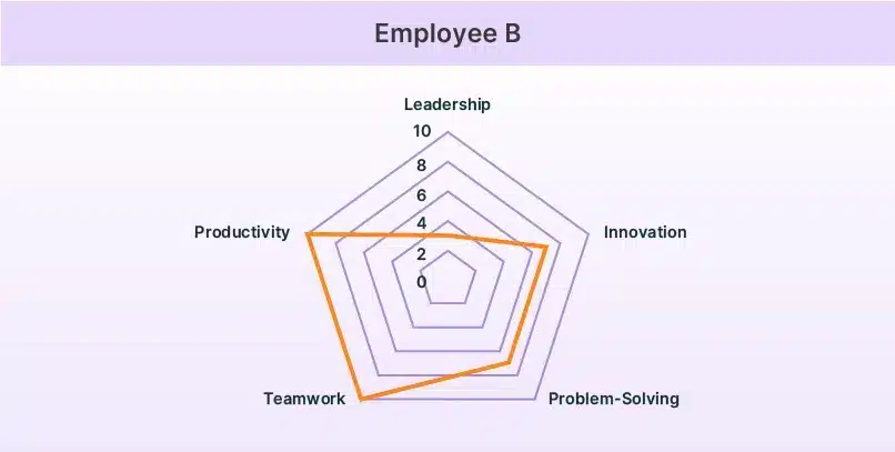
Then there’s Blair (Employee B)
Blair is your team powerhouse. They’re excellent at working with others (10/10) and getting things done (10/10). They’re also good at innovation and problem-solving (both 7/10), but leadership isn’t their strong suit (3/10).

Neither profile is “better” – they’re just different! Smart managers can use these insights to:
- Put each person where they’ll shine brightest
- Create development plans that build on existing strengths
- Pair them on projects where their skills complement each other
Remember: Great teams are like puzzles – different shapes that fit together perfectly to create something amazing!
🕷️ When to Use a Spider Chart?
Spider charts can be useful in scenarios where clear, comparative visualization of multiple metrics is needed. Here are some unique scenarios where spider charts shine:
1. Quarterly or Annual Reviews
As we have seen, spider charts provide a holistic view of an employee’s performance across multiple competencies. By taking a quick glance during quarterly or annual reviews, managers can identify the employee’s strengths and weaknesses and use them to facilitate constructive 1:1 discussions.

2. Team Performance Comparisons
Want to understand how different teams complement each other? Spider charts reveal each team’s unique fingerprint of skills. For example, your marketing team might excel at creativity while your tech team shines in problem-solving. This insight helps leaders build stronger, more balanced teams and share best practices across departments.
3. Development Tracking
If your employees are working on skill improvement, spider charts can track progress over time. By comparing spider charts from different time periods, you can:
- Celebrate improvements in specific areas
- Identify where training paid off
- Spot skills that need more attention
- Keep motivation high by visualizing progress
4. Complementing Numerical or Written Appraisals
Spider charts are particularly effective when paired with numerical or written evaluations. While numbers and text provide depth and context, spider charts offer a visual representation. Together, they can make any complex data easier to understand at a glance. This dual approach ensures an unbiased, efficient, and balanced appraisal process.
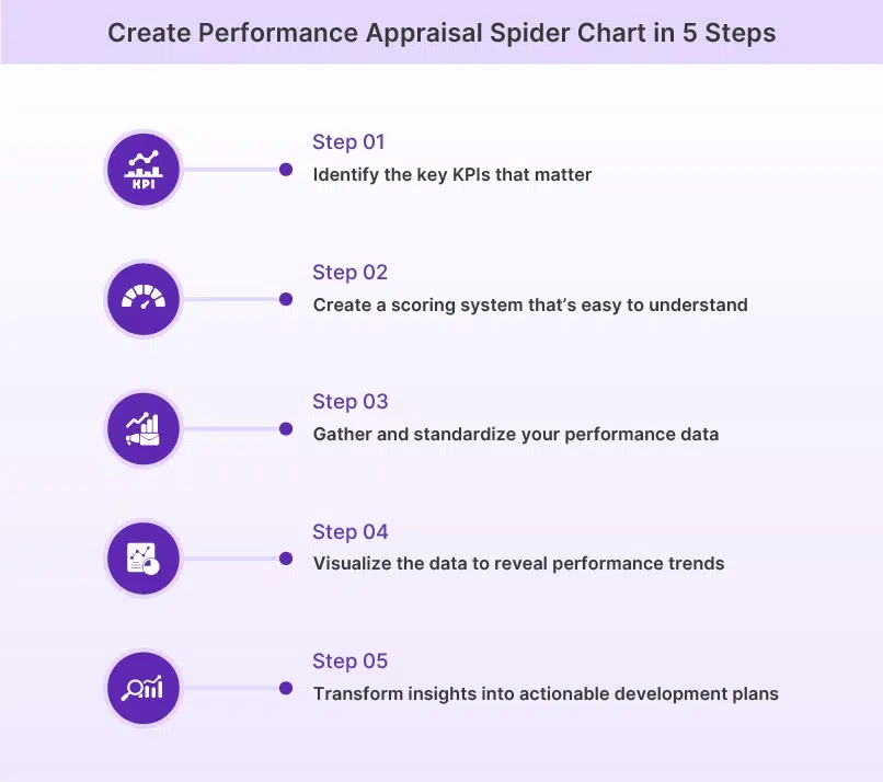
Ready to create your own spider chart? Let us show you how in 5 easy steps.
5 Quick Steps to Create a Performance Appraisal Spider Chart
Here is a methodical approach to creating a performance appraisal spider chart that effectively visualizes multi-dimensional performance data:

Step 1: Map KPIs That Truly Matter
Choose the metrics that truly matter for each role. Think carefully about which skills, behaviors, and outcomes drive success in your organization. These become the axes of your spider chart, creating a framework for meaningful evaluation.
The key is to identify anywhere between 5-7 core competencies specific to that role. It could be teamwork, leadership, technical skills, innovation, and so on. However, you must ensure that metrics are measurable.
Step 2: Design Your Performance Scoring Framework
Create a scoring system that everyone can understand and use consistently. Whether you choose 1-5 or 1-10, clarity is key. Your scale becomes the foundation for fair and meaningful evaluations.
Develop clear descriptions for each score level. For example, a “9” in leadership might mean “consistently inspires teams, drives innovation, and delivers exceptional results.” These descriptions ensure everyone evaluates using the same standards.
Step 3: Gather and Normalize Performance Data
Accurate and standardized data is important for a successful spider chart. You must always source performance data from multiple sources. Use self-assessments, manager evaluations, peer feedback, or any other relevant inputs to ensure a comprehensive view.
More importantly, the data collection method must be consistent to maintain fairness and minimize bias. You should also normalize the raw performance data by adjusting it to a common scale. In the spider chart, it is important to create a balanced and comparable visualization across individuals or teams.
With performance management software like Peoplebox.ai, collecting performance data becomes a breeze. Try it yourself!
Step 4: Plot the Data and Decode the Visual Performance Story
Once the data is ready, plot it on a spider chart, connecting the dots to reveal patterns of performance. This is where your spider chart comes to life.
Look for patterns that highlight skill gaps and unexpected strengths. It will let you gain a deep understanding of the performance landscape. Additionally, you can use the chart to detect potential biases or inconsistencies in assessments to ensure a fair evaluation process.
Step 5: Transform Insights into Strategic Development Plans
Create employee development plans that benefit both the individual and the organization. Set specific, measurable goals that address gaps while building on existing strengths.
While devising the strategy, set measurable development goals to address identified gaps. Ensure that these objectives align with both team and organizational goals. Put simply; you must create growth that benefits all stakeholders in the organization.
Now that you know how to create spider charts, let’s explore how to use them effectively to avoid common pitfalls and maximize their impact.
Best Practices in Creating a Performance Appraisal Spider Chart
Here are some useful tips you can follow while creating your performance appraisal spider chart so that you can derive substantial value from the same:
- Choose metrics that align with the role’s responsibilities and your organization’s objectives. Avoid generic or irrelevant indicators, as they will dilute the evaluation’s focus.
- Ensure the number of metrics is between 5-7. Including too many dimensions can overwhelm the chart. Too little means the chart’s purpose is defeated, as you can manage even with simple bar graphs.
- Establish consistent scoring frameworks and benchmarks. Ensure the evaluation is completely objective and free of bias. This will promote trust and transparency in the appraisal process.
- Engage employees in collaborative discussions about their performance using the spider chart. This will help create a shared understanding of the evaluation. s that the appraisal process is not just top-down but also inclusive and constructive.
- Periodically review and refine the selected metrics. It must reflect changes in job roles and organizational priorities. Regular updates ensure the chart remains a dynamic and usable tool for performance evaluation.
🥨 How can Peoplebox.ai Help?
Peoplebox.ai. is a dynamic employee engagement platform that smartly integrates feedback, goal-tracking, and structured evaluations to streamline performance management. The platform offers actionable insights to facilitate data-driven appraisals. Visualizing these insights using a spider chart can make your appraisal decisions more impactful.
It simplifies the process of setting and tracking measurable goals, which is quite helpful for objectively measuring the different dimensions of a spider chart. These goals can be tied to performance outcomes, enabling you to monitor progress with great ease.
Finally, Peoplebox.ai supports structured one-on-one sessions. These sessions create an effective forum for discussing your findings from the spider chart with the employee and offering personalized feedback. You can also use these 1:1 sessions to provide actionable guidance and build a culture of continuous improvement.
Ready to build a thriving workforce? Get in touch with us today!


